Provenance Hotels
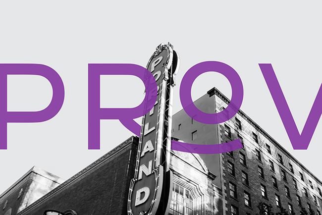
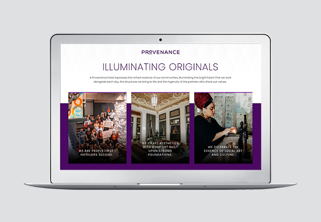
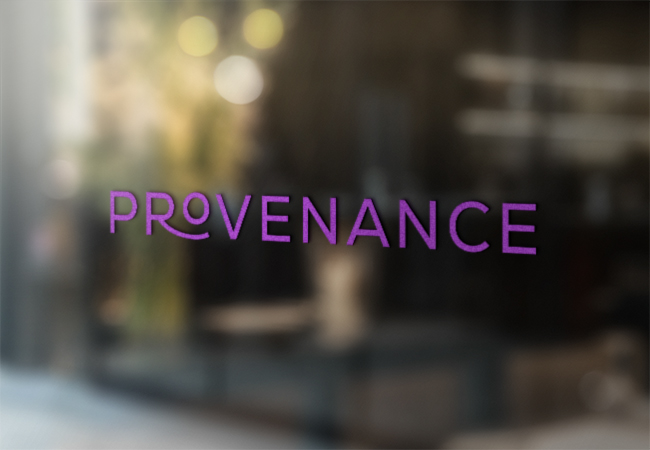
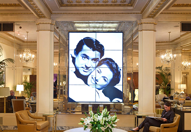
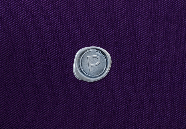
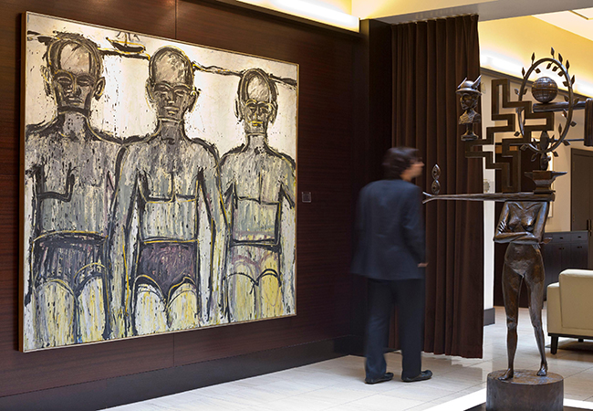
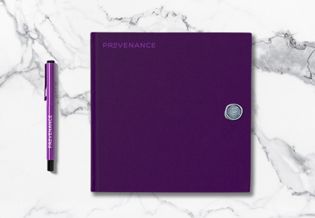
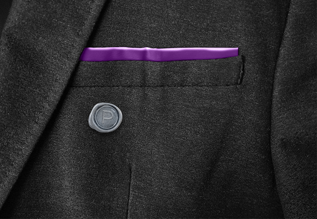
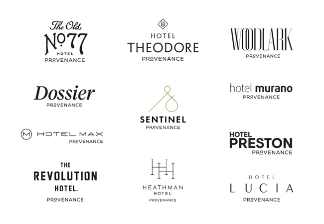
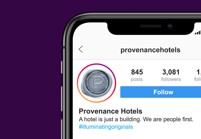
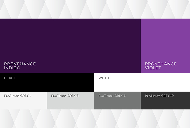
This upscale nationwide boutique hotel collection offers authentic local hospitality experiences, redesigned around old buildings. “Provenance has to be its own brand,” advised Agency Sacks, “But, regarding the balance with all the individual hotel identities…” “Gotcha,” we replied, “Do not disturb.” Our logo features a conjoined R and O, a stonecutter’s ligature that’s also a caring arm supporting the o, a little lift of luxury offered to each guest. For authenticity, a “P” seal was the perfect secondary graphic element, and the grey hue of the wax represents friendship. Finally, we provided a rich, sophisticated palette of indigo, violet and grey. The system was duly rolled out in digital, print, social and signage. It seems to have stayed with a lot of people. And vice versa.

Credits
AGENCY: Agency Sacks
CLIENT: Provenance Hotels
STRATEGY: Erik Attkisson
PHOTOGRAPHER (BUILDING): Austin Neill
PHOTOGRAPHER (SIGN): Zach Savinar