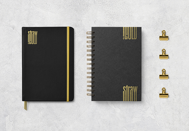
Straw To Gold
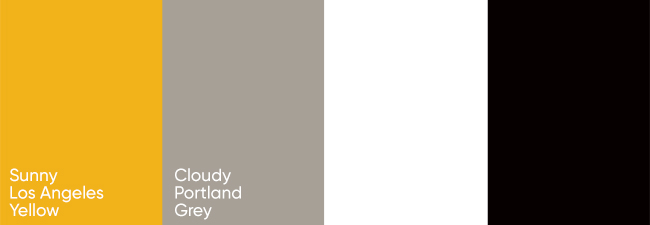
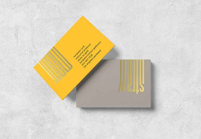
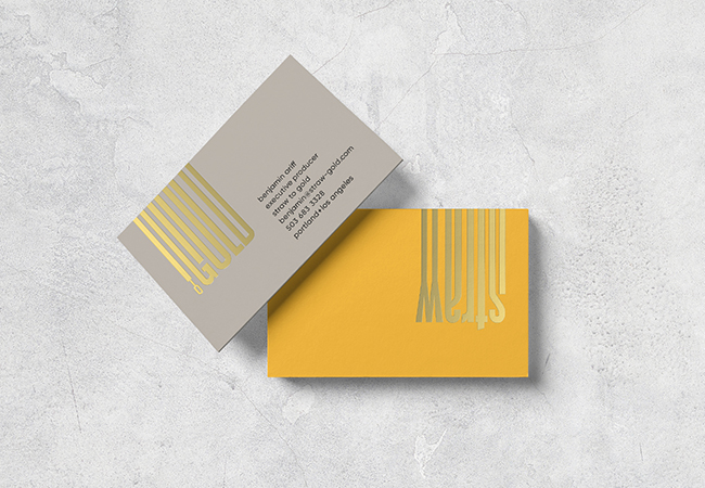
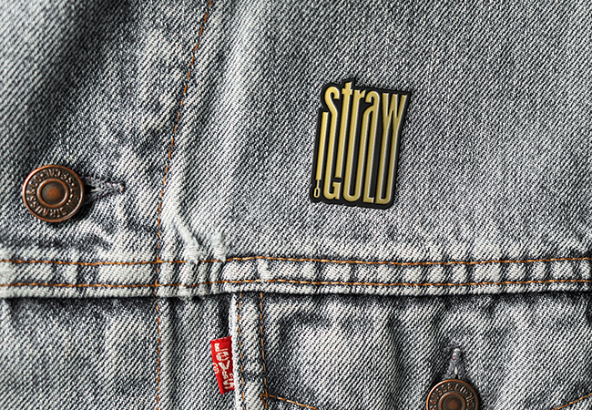
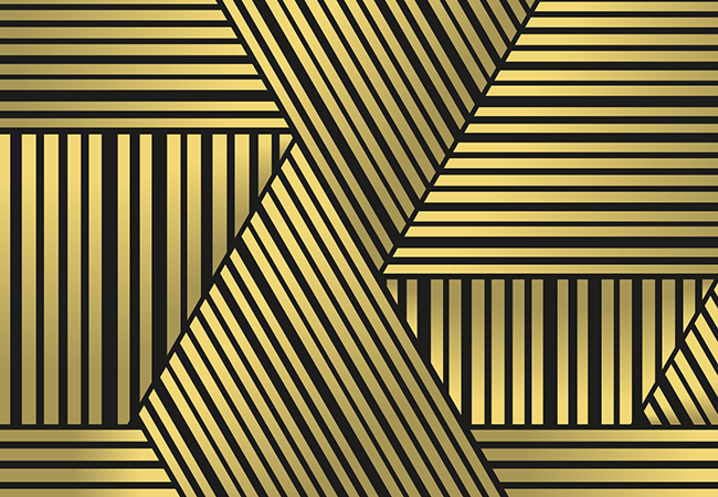
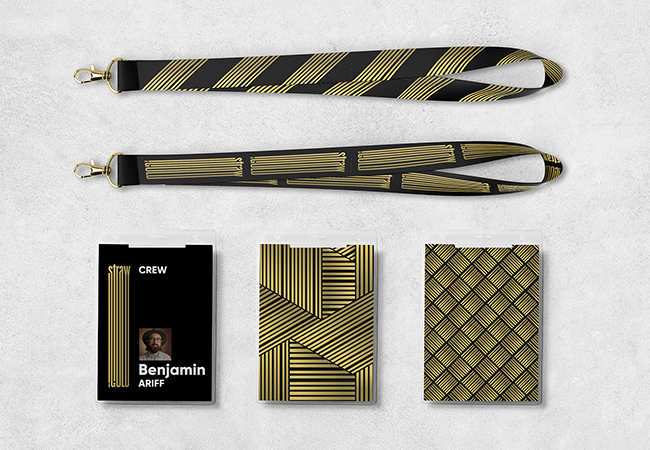
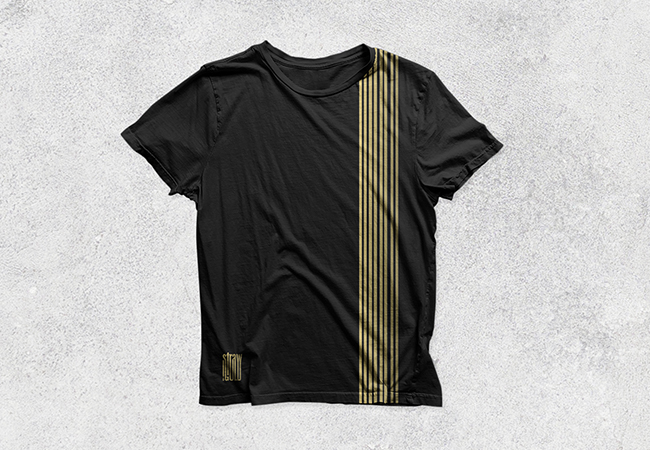
Once upon a time, a digital brand solutions company whose name was inspired by The Brothers Grimm fairytale, Rumpelstiltskin, asked us to create their identity. In Straw To Gold we saw a chance to make something memorable and flexible through fluid, dynamic typography that connects the phrase, reflecting the rare alchemy and transformative effect they bring to each assignment. The result anchors a distinctive visual language, complementing their focus on the moving image, and featuring a color palette that references their two HQs: cloudy Portland grey and sunny LA yellow. And, yes, they and their clients lived happily ever after.