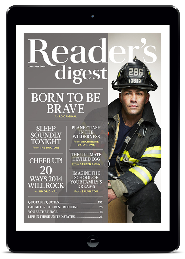
Reader’s Digest
“Hold the front page!” Redesigning the cover of one of the most-read media brands, we realized that our best design direction reinforced the publication’s unique appeal: collecting a spectrum of engaging articles in one place. So why not incorporate and feature a table of contents on the cover? The client swallowed it; for print and tablet editions. Plus we got a lifetime subscription.

Credits
AGENCY: DiMassimo Goldstein
CLIENT: Reader’s Digest
CREATIVE DIRECTOR: Ty Wong

