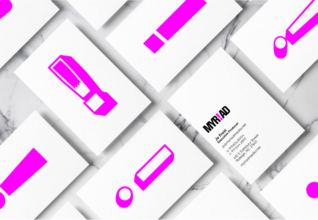
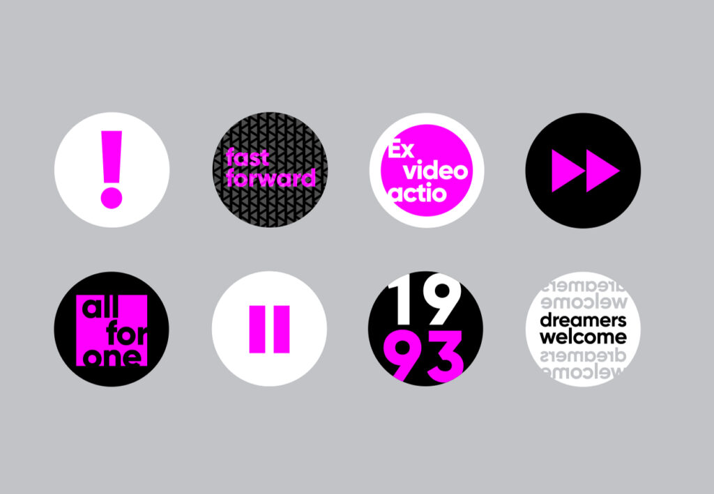
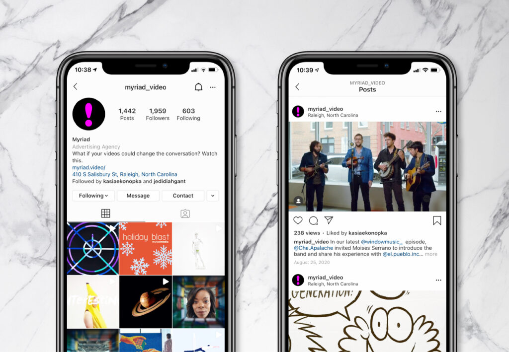
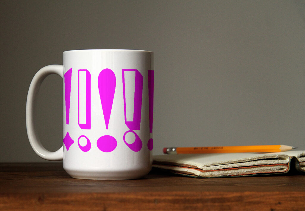
MYR!AD
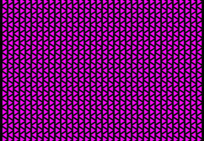
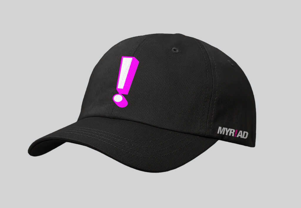
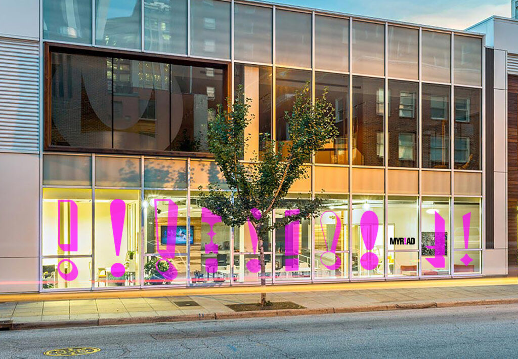
Clients committed to inspiring social and cultural change come to Raleigh-based Myriad for their videos, because they really have it all taped. To express their work’s impact in their new identity, we replaced the “i” in their name with the most dramatic character in our type toolbox: the exclamation mark. With some vivid magenta and multi-font animation within a classic solid san serif structure, we conveyed the transformative creativity they bring to each project – as well as giving a nod to the word’s literal meaning. This cued up their whole system from print to digital to environmental, along with a palette based on the video color bars, and iconography for backgrounds using patterns of the play and pause symbols. They didn’t edit their response: it was all font-tastic.