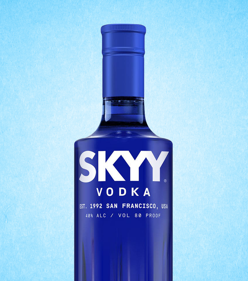
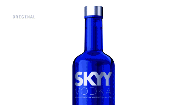
SKYY vodka
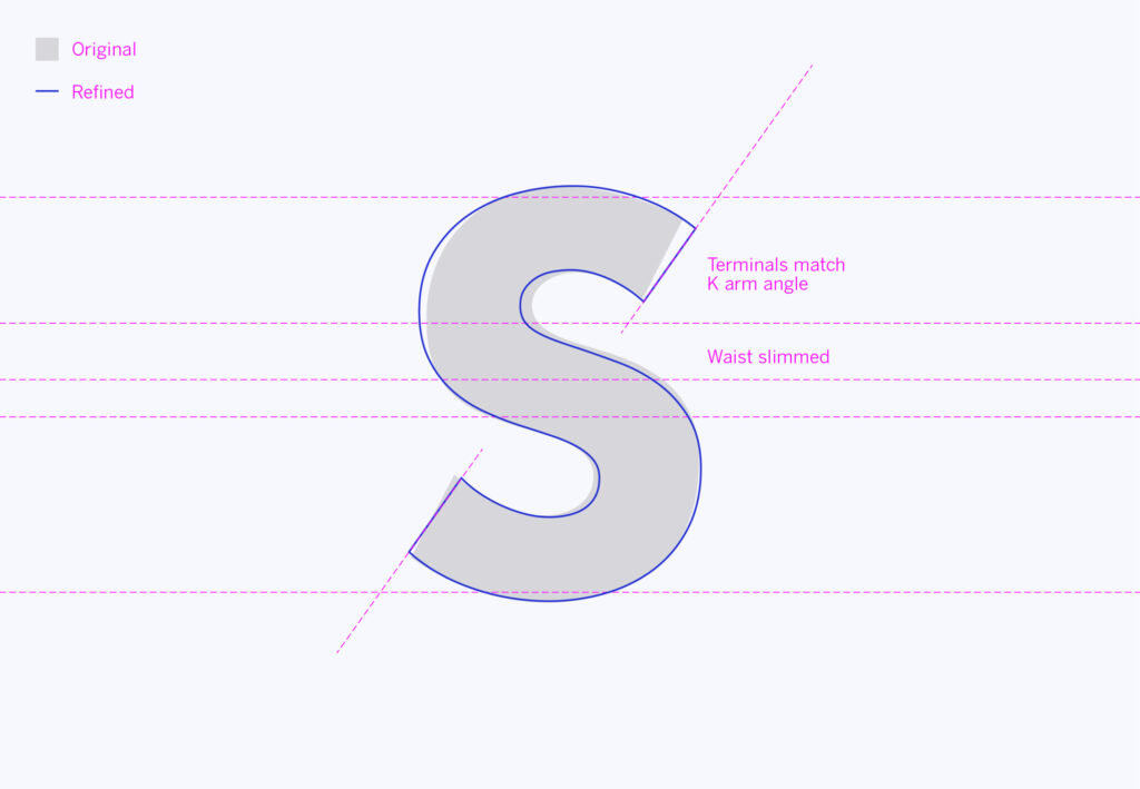
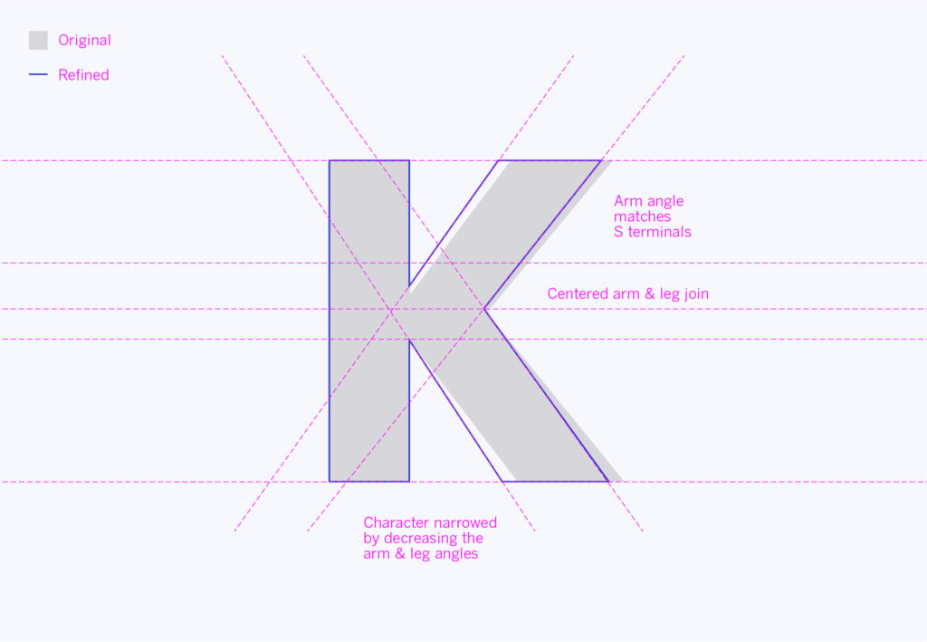
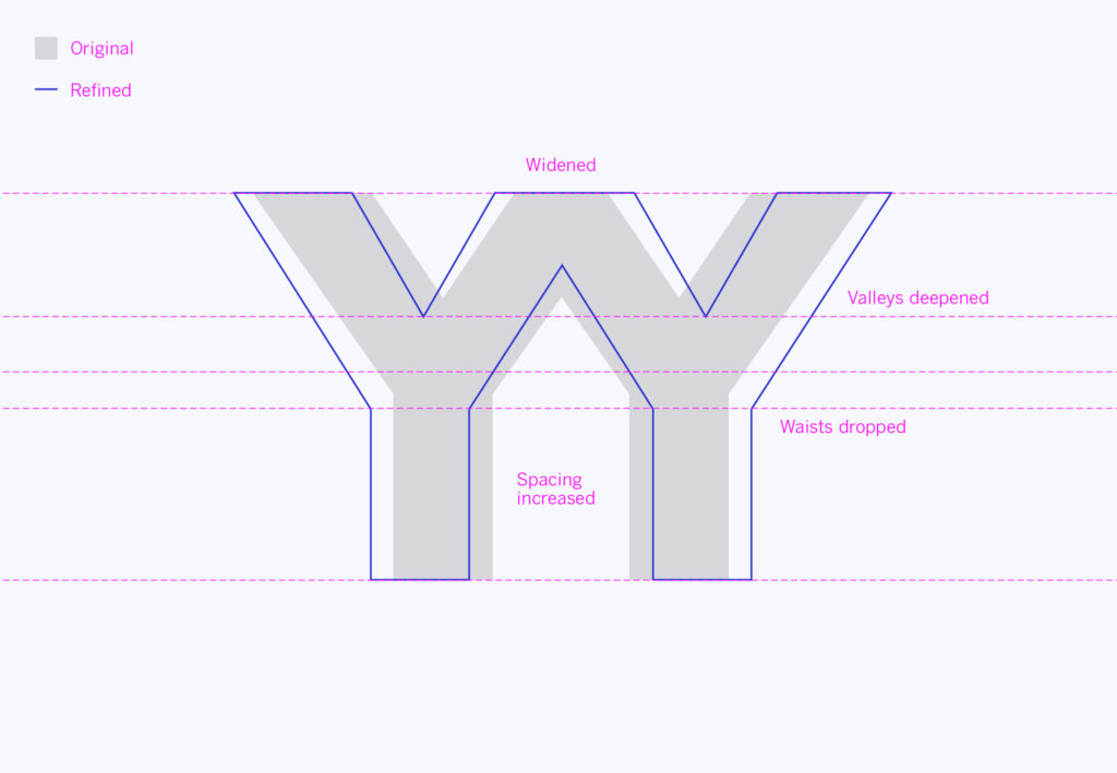
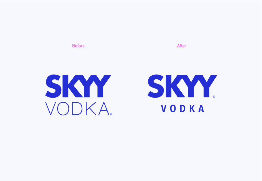
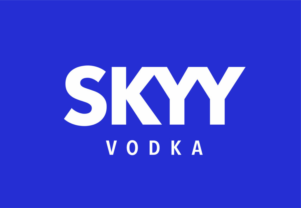
Cheers to design agency Established for encouraging their client to repackage SKYY vodka, and requesting our help in refreshing the look. Neither shaken nor stirred but delicately refined, the logo letterforms now display a more modern mix of spacing, balance and discreetly matching angles (hint: check the k’s and the cocktail glass y’s). Like the improved recipe, it’s a more subtle distillation of the brand’s qualities. So if you pick up a bottle and think it looks (and tastes) better, now you know whyy.