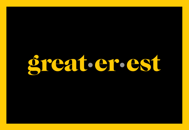
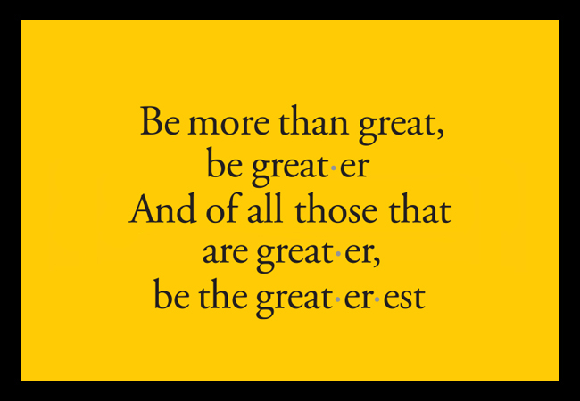
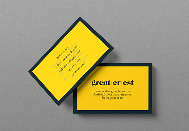
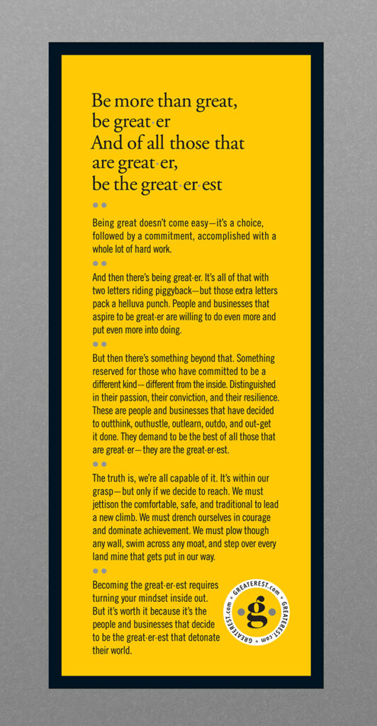
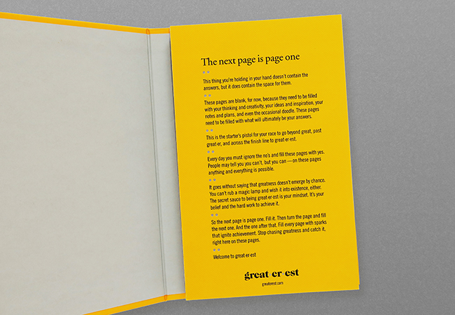
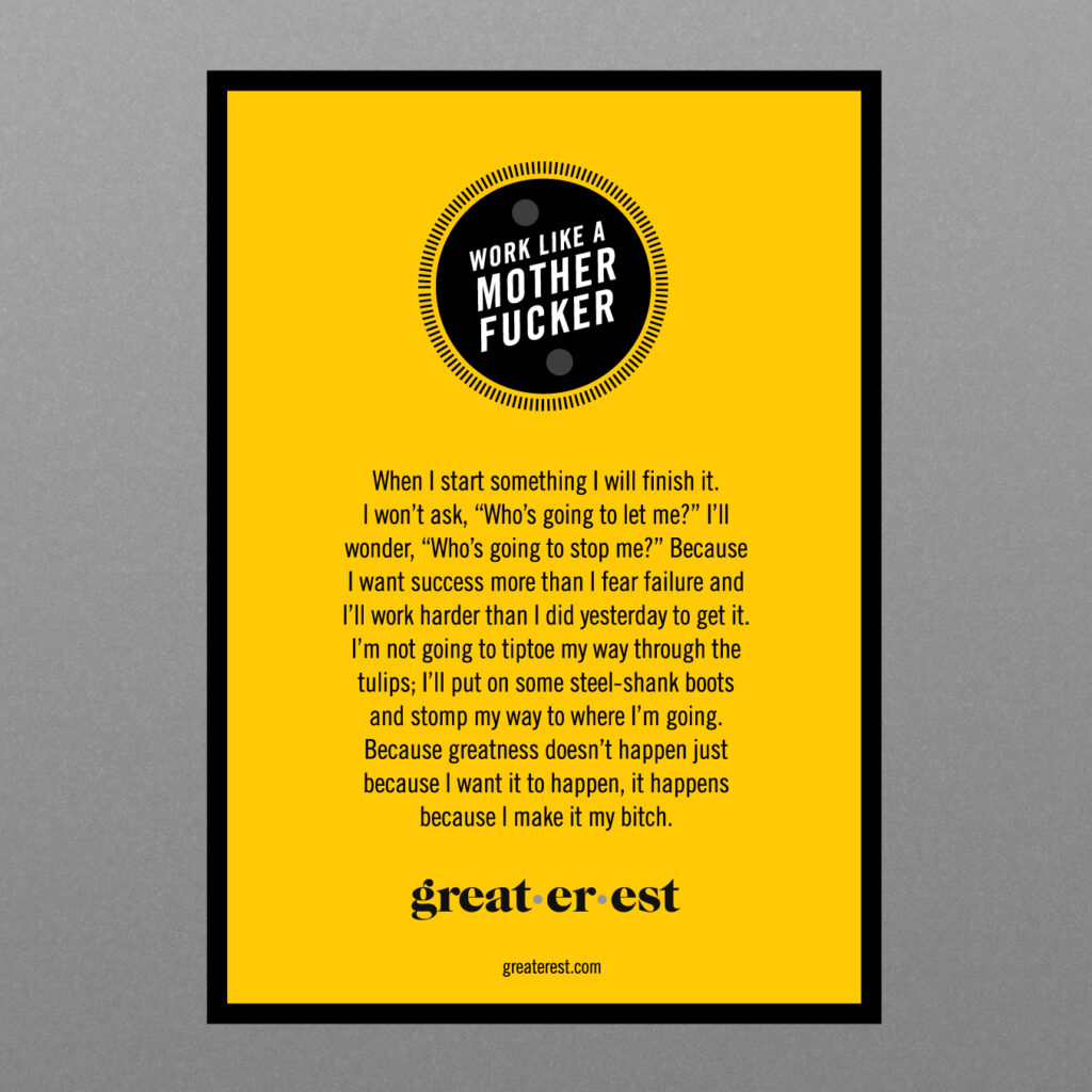
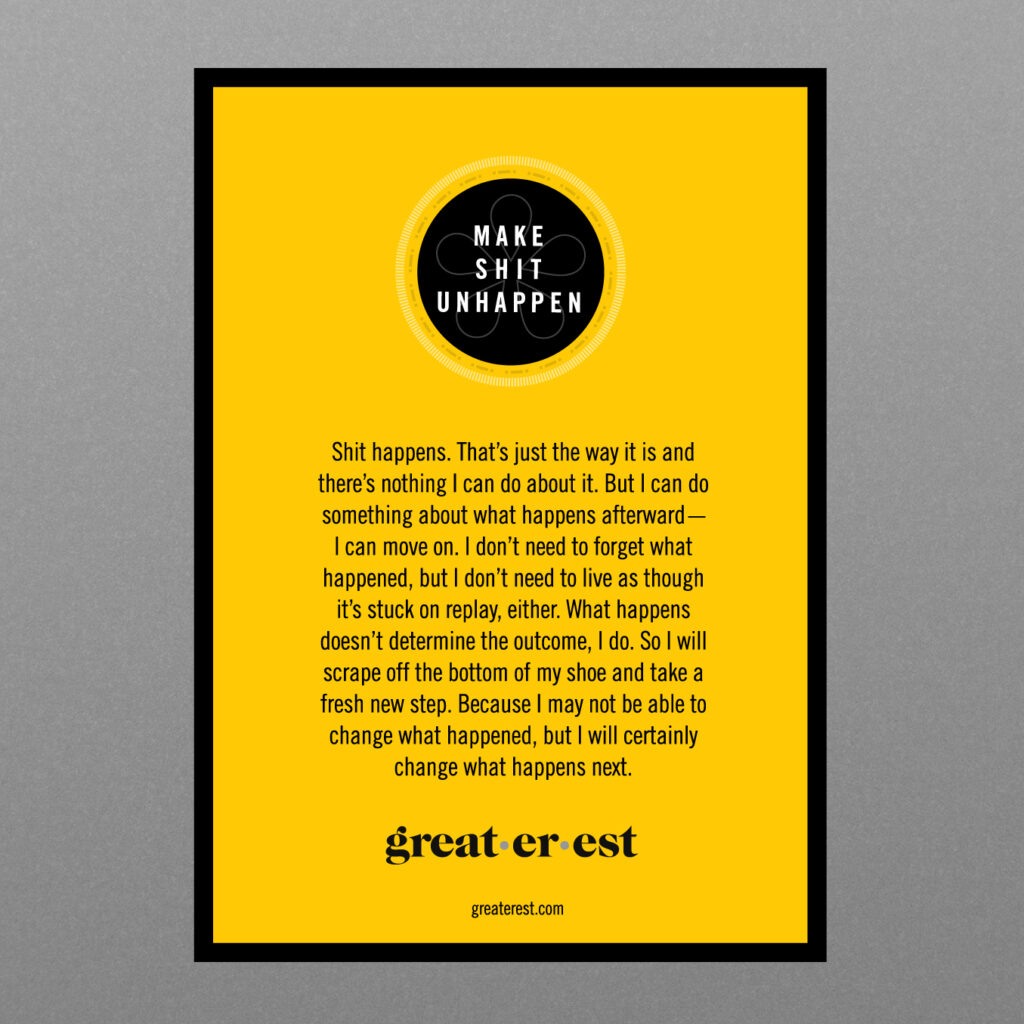
great·er·est
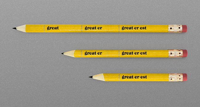
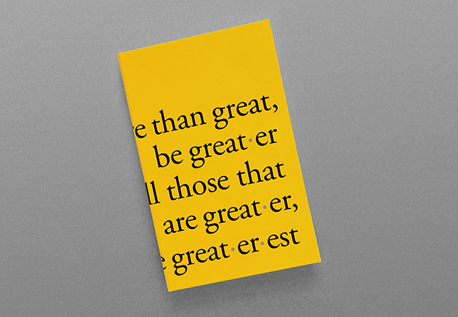
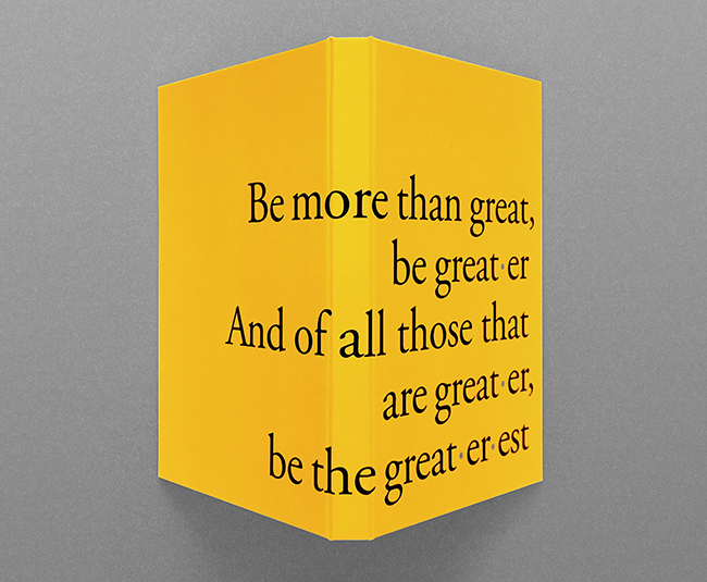
Making identities great·er·est again. When wonder-wordsmith Kevin Roddy wants his new creative venture branded, one tends to give it one’s best shot. Or, rather: best·est, since “great·er·est” exudes playful exaggeration – but, like its founder, has the heft to back the hyperbole. We produced a color palette based on the humble pencil and an elegant wordmark, given a dictionary-masthead spin. Dotting the identity system are some serious points – or, rather, interpuncts. That’s their real name: in Latin script, they separated words; here, they stand for connection and collaboration. Which, with me and Kevin on opposite coasts, was how this project flourished. Plus, considering our new reality, they’re values that have never been more important·er.